Building an Animated Progress Meter View With SwiftUI
When it comes to SwiftUI, I am but a pup, wet behind the ears.1
However, I encourage my own students to explain their work to others either in writing or with a video. If you can clearly communicate an idea to others using correct vocabulary then you really understand it. So it is in that spirit that I share this article on how to build a composable progress meter view – the first time I've built something in SwiftUI that I feel might be useful to others.
If you are an experienced SwiftUI developer and have feedback about what I've written – I welcome it! I am very much responsible for any errors or inaccuracies.
Goals
After reading this article, you should have an understanding of how to:
- combine
HStack,VStack, andZStackviews - use animations to highlight a transition between view states
- use a
GeometryReadercontainer view to ensure the progress meter adapts to varying screen sizes - apply the hue-saturation-brightness model to represent colors
- build a lightweight, composable view that accepts parameters
Here is what the finished progress meter looks like – in this case, embedded within a multiplication practice app:
Showing progress toward a goal
Note that the progress meter view adapts to different device sizes.
Feel free to pause and come back to the tutorial as you complete each logical section. This is a somewhat lengthy article. Let's begin!
Arranging the Views
Begin by creating a new iOS App named ProgressMeter.
NOTE: If you are using Xcode 11, whenever a property of the
ContentViewstructure is referenced below in this tutorial, you must insertself.prior to the property name. This is not required in Xcode 12.
In ContentView.swift you should see something like the following:
import SwiftUI

struct ContentView: View {
    var body: some View {
        Text("Hello, world!")
            .padding()
    }
}

struct ContentView_Previews: PreviewProvider {
    static var previews: some View {
        ContentView()
    }
}
Let's begin by defining a Rectangle view that will form the first part of our progress meter.
For the time being, we'll work with constant dimensions, and later, introduce GeometryReader to gain a flexible layout. I like to build views against the smallest possible device. In Xcode 12, this is the iPod Touch (7th generation). In Xcode 11, this is the iPhone SE (1st generation) – though you may have to add that simulator manually at first. Based on this handy screen size chart, the maximum available height for these devices will be 548 points (that's 568 less 20 points for the toolbar). Set your run destination now.
Then replace the Text view inside the body property with:
Rectangle()
	.frame(width: 100, height: 548 - 44, alignment: .center)
You'll note the use of an expression, 548 - 44, as the height argument. That's deliberate; we'll revisit this later on.
Moving on, to create the appearance of a progress meter "filling up" we'll need another view.
We're going to make another Rectangle that slides up, revealing the Rectangle below it.
Since the View protocol requires that a single view is returned for the body property, we'll embed both of the rectangles in a VStack:
VStack {
	// "Fill" for progress meter; stationary
	Rectangle()
		.frame(width: 100, height: 548 - 44, alignment: .center)
	// Will slide up
	Rectangle()
		.frame(width: 100, height: 548 - 44, alignment: .center)
}
As you can see, that's not what we want. At the moment the two rectangles are, as we've described with our code, vertically stacked upon one another.
To create the illusion of a filling progress meter, we need to make use of the z-axis. The rectangle that slides up must be at the front, so it is listed second in the ZStack.
Adjust the code to introduce a ZStack:
VStack {
	ZStack {
		// "Fill" for progress meter; stationary
		Rectangle()
			.frame(width: 100, height: 548 - 44, alignment: .center)
		// Will slide up
		Rectangle()
			.frame(width: 100, height: 548 - 44, alignment: .center)
	}
}
Now the two rectangles sit upon one another.
The second rectangle needs a different color. Rather than specifying black or white, we use the primary color, so that the view works on a device in both light and dark modes. By inverting that color, we get the opposite:
// Will slide up
Rectangle()
	.fill(Color.primary)
	.colorInvert()
	.frame(width: 100, height: 548 - 44, alignment: .center)
Now the fill of the rectangle that will slide up matches the background.
At this point, it appears as though no views are present at all!
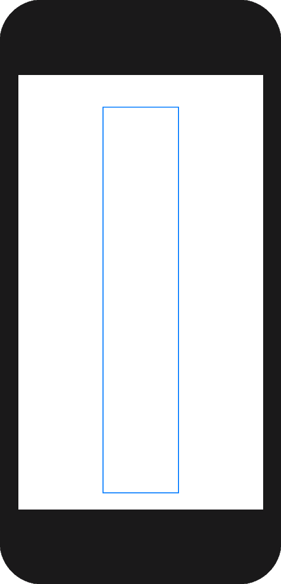
However, if you place your cursor in Xcode on the line of code that defines either of the Rectangle views, you'll see a faint blue outline showing you where the view is:
The offset view modifier allows us to "[o]ffset [a] view by the horizontal and vertical amount specified in the offset parameter."
Add the following modifier to the second rectangle – the view that will slide up:
.offset(CGSize(width: 0, height: -1 * (548 - 44)))
This immediately places the rectangle that will slide up vertically above the rectangle that will represent the fill of the progress meter. You should see only a black rectangle.
Not what we want, right? It's time to consider the state of our view. As you've heard often while learning SwiftUI, views are a function of state.
Where do we want the rectangle that will slide up to begin?
Directly on top of the rectangle behind it.
Where do we want the rectangle that will slide up to finish?
Positioned vertically above the rectangle behind it.
We need to create state to manage this.
Add the following property to the ContentView struct:
struct ContentView: View {

    // For driving animation to reveal rectangle with progress meter fill
    @State private var progressMeterOffset = CGSize.zero

    var body: some View {
        ...
    }
}
Change the offset for the second rectangle so that it's offset is tied to the new progressMeterOffset property, which begins at zero:
.offset(progressMeterOffset)
We're back to having the rectangle that will slide up sitting directly on top of the rectangle behind it – save for the light blue outline, it again looks like there are no rectangles present at all.
What to do?
As soon as that second rectangle appears, we want it to move to its new position. So, add the following modifier below the existing offset modifier:
.onAppear(perform: {
	// Offset is moves the opaque rectangle up
	progressMeterOffset = CGSize(width: 0, height: -1 * (548 - 44))
})
This tutorial probably doesn't feel very useful right now! 😅
The rectangle that is to slide up now jumps immediately to its new offset.
It just looks like there is a single black rectangle – the view that represents the progress meter fill!
The key is the addition of an animation, to make the transition between states occur over some defined period of time.
Adjust the onAppear view modifier as follows:
.onAppear(perform: {
	withAnimation(Animation.easeIn(duration: 4.0)) {
		// Offset is moves the opaque rectangle up
		progressMeterOffset = CGSize(width: 0, height: -1 * (548 - 44))
	}
})
Initially the second rectangle has an offset of zero.
As soon as the second rectangle appears, the offset is changed to the new value.
The change in state between those two offsets is animated over the course of four seconds.
At this point, you should see the following:
Basic progress meter
As the view that matches the background color slides up using the animation, it reveals the view below it.
That's pretty nice, but before the animation is finished, we have no sense of the size of the progress meter, or how far progress is from "complete".
To do this, we need a border.
Our first instinct would be to do just that – put a border on the rectangle in the background.
Let's try that – add a stroke modifier to the first rectangle:
// "Fill" for progress meter; stationary
Rectangle()
	.stroke(Color.primary, lineWidth: 4)
	.frame(width: 100, height: 548 - 44, alignment: .center)
As you can see, the results are less than ideal.
The rectangle that animates as it moves upward to a new offset makes our progress meter appear to have an open top.
For that reason alone we need a different approach.
Remove the stroke modifier that we just added.
Add a third rectangle enclosed within the ZStack, like this:
// Sits above the rectangle that slides up (in the z-axis)
// This means the rectangle sliding up will pass beneath this view
Rectangle()
	.fill(Color(hue: 0, saturation: 0, brightness: 0, opacity: 0))
	.frame(width: 100 + 2, height: 548 - 44 + 2, alignment: .center)
	.overlay(
		Rectangle()
			.stroke(Color.primary, lineWidth: 2)
	)
You should now have:
Progress meter with a border
The top-most view on the z-axis has a transparent fill. We see the other views below it, creating the appearance of a rising progress meter.
Let's break that down.
First, the new rectangle that provides the border must have a transparent fill.
Try commenting out the fill modifier:
// .fill(Color(hue: 0, saturation: 0, brightness: 0, opacity: 0))
You'll notice we have a static image again. That's because the third view in the ZStack, sitting above the other two views, has an opaque fill and border. We can't see what's happening beneath it.
Uncomment the fill modifier. More on hue, saturation, and brightness a little later. The key here is that opacity is set to 0, which means that no matter what the color is, the fill is completely transparent.
Next, you'll notice the width of the frame for this view is an expression, in this case, 100 + 2:
.frame(width: 100 + 2, height: 548 - 44 + 2, alignment: .center)
The rectangles below this one, on the z-axis, also have a width of 100 points.
By adding 2 points to the width of this topmost view, it ensures that the entire border will be visible, and that we can see the views underneath it.
The final view modifier creates the border:
.overlay(
	Rectangle()
		.stroke(Color.primary, lineWidth: 2)
)
Eliminating Magic Constants
When teaching I encourage my students to start simple. That's what we've done here, but a problem is starting to emerge in our code. Let's review – the entirety of ContentView structure should now look like this:
struct ContentView: View {

    // For driving animation to reveal rectangle with progress meter fill
    @State private var progressMeterOffset = CGSize.zero

    var body: some View {
        VStack {
            ZStack {
                // "Fill" for progress meter; stationary
                Rectangle()
                    .frame(width: 100, height: 548 - 44, alignment: .center)

                // Will slide up
                Rectangle()
                    .fill(Color.primary)
                    .colorInvert()
                    .frame(width: 100, height: 548 - 44, alignment: .center)
                    .offset(progressMeterOffset)
                    .onAppear(perform: {
                        withAnimation(Animation.easeIn(duration: 4.0)) {
                            // Offset is moves the opaque rectangle up
                            progressMeterOffset = CGSize(width: 0, height: -1 * (548 - 44))
                        }
                    })

                // Sits above the rectangle that slides up (in the z-axis)
                // This means the rectangle sliding up will pass beneath this view
                Rectangle()
                    .fill(Color(hue: 0, saturation: 0, brightness: 0, opacity: 0))
                    .frame(width: 100 + 2, height: 548 - 44 + 2, alignment: .center)
                    .overlay(
                        Rectangle()
                            .stroke(Color.primary, lineWidth: 2)
                    )

            }

        }

    }
}
We've repeated several expressions. Let's say we wanted to make our progress meter a little wider. We'd have to change arguments in three locations!
This calls for the introduction of a constant property.
Add the following to the structure:
// Width of the meter
let meterWidth: CGFloat = 100
Anywhere that you see the constant 100, replace this with the name of the constant, meterWidth.
We can do the same thing for the thickness of the border:
// Thickness of meter's border
let borderWidth: CGFloat = 2
Anywhere that you see the constant 2, replace this with the name of the constant, borderWidth.
Finally, the same can be done for the padding above and below the meter, which is currently set to 44 points2 (22 points above, and 22 points below, since the view is vertically centred):
// Padding above and below progress meter
let verticalPadding: CGFloat = 44
Anywhere that you see the constant 44, replace this with the name of the constant, verticalPadding.
The code should now look like this:
struct ContentView: View {

    // For driving animation to reveal rectangle with progress meter fill
    @State private var progressMeterOffset = CGSize.zero

    // Width of the meter
    let meterWidth: CGFloat = 100

    // Thickness of meter's border
    let borderWidth: CGFloat = 2

    // Padding at top of progress meter
    let verticalPadding: CGFloat = 44

    var body: some View {
        VStack {
            ZStack {
                // "Fill" for progress meter; stationary
                Rectangle()
                    .frame(width: meterWidth, height: 548 - verticalPadding, alignment: .center)

                // Will slide up
                Rectangle()
                    .fill(Color.primary)
                    .colorInvert()
                    .frame(width: meterWidth, height: 548 - verticalPadding, alignment: .center)
                    .offset(progressMeterOffset)
                    .onAppear(perform: {
                        withAnimation(Animation.easeIn(duration: 4.0)) {
                            // Offset is moves the opaque rectangle up
                            progressMeterOffset = CGSize(width: 0, height: -1 * (548 - verticalPadding))
                        }
                    })

                // Sits above the rectangle that slides up (in the z-axis)
                // This means the rectangle sliding up will pass beneath this view
                Rectangle()
                    .fill(Color(hue: 0, saturation: 0, brightness: 0, opacity: 0))
                    .frame(width: meterWidth + borderWidth, height: 548 - verticalPadding + borderWidth, alignment: .center)
                    .overlay(
                        Rectangle()
                            .stroke(Color.primary, lineWidth: borderWidth)
                    )

            }

        }

    }
}
The advantage here is we can quickly make adjustments. Want less padding? Change verticalPadding in one location. Want a thicker border? Adjust the borderWidth property.
Beyond convenience for adjusting the look of our progress meter, the code is simply more readable. We no longer have to think about what 100 or 44 represent when reviewing an expression. We can see what's happening by the property names we chose – the expressions are self-documenting.
Try changing some of the new constants you just added and observing how that affects the animation.
You're probably wondering – what about 548? When are we going to address that?
Using GeometryReader to Create an Adaptive Layout
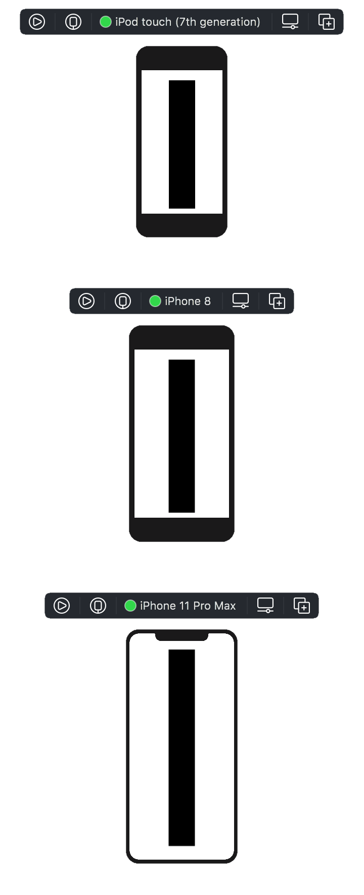
Change the iOS simulator to be the iPhone 11 Pro Max, or really any device larger than the iPod Touch.
You see the problem with the remaining "magic constant" of 548:
Progress meter on a larger device
548 points of height works on an iPod Touch, but not the iPhone 11 Pro Max.
To correct for this, we can place the VStack and all its contents inside a GeometryReader container view:
var body: some View {
	GeometryReader { geometry in
		VStack {
			...
		}
	}
}
NOTE: If you are using Xcode 11, after you place the
VStackinsideGeometryReader, you'll need to update references to properties to include theself.prefix. If you're not sure what this means, don't worry, you'll see the red compiler warnings soon enough. 😅
The developer documentation describes GeometryReader as "[a] container view that defines its content as a function of its own size and coordinate space."
In practice, that means we can use the geometry parameter to gain information about the size of the surrounding view.
Temporarily comment out the VStack and all it's contents, so that the only view inside GeometryReader is a Text view like this:
Text("Height is \(geometry.size.height)")
On an iPhone 11 Pro Max, there are 818 points available to work with, vertically.
If you wish, try changing to other simulators. You will see that the reported geometry.size.height value changes accordingly.
Now remove the Text view and uncomment the VStack and all its contents.
Replace any reference to the constant 548 with geometry.size.height instead.
Try changing to other simulators.
You will see that the progress meter now always fills the available vertical space. That's the power of GeometryReader!
As you've surely also noticed, since moving our views inside GeometryReader, the meter is no longer centred in the middle of the screen3.
I'm honestly not sure why this happens, but we can correct for it by judicious use of Spacer views.
To split the vertical padding evenly as we had before, just add Spacer() views before and after the ZStack, within the VStack:
VStack {

	Spacer()

	ZStack {
		...
	}

	Spacer()

}
To centre the meter once again, we need to introduce an HStack.
We'll sandwich the ZStack between two Spacer views inside the horizontal stack:
VStack {

	Spacer()

	HStack {

		Spacer()

		ZStack {
			...
		}

		Spacer()

	}

	Spacer()

}
And just like that, we're back to having our progress meter positioned as before4 except now it responds to varying device sizes:
Creating a Colorful Progress Meter
In my youth I played video games more often. I recall enough about gaming to know that a "health meter" is usually red when a player is low on health, and green when things are going well.
That's the inspiration for this next change to the progress meter.
The closer it gets to "full" the more green we want the fill to be.
I won't go into a full discourse on how to represent color on a computer here, because I am not an expert, and this article is already getting a bit long!
Suffice it to say, the hue of a color can be represented as a value between 0 and 360 degrees. 0 is red, 60 degrees is yellow, 120 degrees is green, and so on. You can see a few examples and read more here, if you like.
What we will do is fill the progress meter with a gradient.
The bottom, or start, of the gradient will always be red, so, 0 degrees for a hue.
The top, or end, of the gradient will be green if the progress meter is "full", or something less than green if the progress meter is not full.
First, we'll introduce a couple of constants to express how "full" the progress meter is. Since I wrote this progress meter initially to serve on a results screen for a multiplication practice app, the constants are named to reflect that:
// Needed data to calculate colors and size of meter
let correctResponses: Int = 10
let questionCount: Int = 10
The percentage of a full progress meter can be expressed with a computed property:
// Percentage of full progress meter
// If the progress meter is full, this will equal 1.0
private var fractionOfFullMeter: Double {
	Double(correctResponses) / Double(questionCount)
}
And the ending color of the gradient can also be expressed using a computed property:
// Ending color for progress meter
// 120/360 degrees or 0.333 in Color struct terms is green
// which is the top of the meter when all questions are correct
private var endColor: Color {

	// If you had 10 out of 10 questions correct, this will equal 120.0 degrees
	let endingHue = fractionOfFullMeter * 120.0

	// Color is:
	// hue: 0-360 degrees, expressed as a value between 0 and 1
	// saturation: 0-100%, expressed as a value between 0 and 1
	// brightness: 0-100%, expressed as a value between 0 and 1
	// see: https://russellgordon.ca/lcs/HSB_Color_Model_Summary_Swift.pdf
	return Color(hue: endingHue / 360.0, saturation: 0.8, brightness: 0.9)
}
In the ZStack, for the rectangle representing the fill of the progress meter (the first rectangle) add the following view modifier right before the frame modifier:
.fill(LinearGradient(gradient: Gradient(colors: [Color.red, endColor]),
					 startPoint: .bottom,
					 endPoint: .top))
If you added the constants, the computed property, and the fill modifier correctly, you should now have this:
Applying a gradient
As the progress meter approaches completion, the colour moves from red to green.
We are not quite finished, however. Reduce the correct responses constant:
let correctResponses: Int = 3
Review the animation:
An incorrect height
At present, while colors are accurate, the progress bar always appears to be complete.
The gradient works as expected, since it barely gets out of the orange range of hues, given that there were only three correct responses out of ten.
However, the height of the progress bar is not accurate.
We can correct that by using the fractionOfFullMeter property to reduce the height of the rectangle that contains the fill of the progress meter.
Change the view modifier for the size of the frame on the first rectangle from the following:
.frame(width: meterWidth, height: geometry.size.height - verticalPadding, alignment: .center)
... to this instead:
.frame(width: meterWidth, height: CGFloat(fractionOfFullMeter) * (geometry.size.height - verticalPadding), alignment: .center)
The animation will now look like this:
Oooh, so close!
Can you predict what we need to do?
The rectangle containing the view is centred vertically in the ZStack that contains it.
There are a couple of ways this could be handled, but we'll correct the problem by adding another rectangle above the progress meter, inside a VStack.
Change this:
ZStack {

	// "Fill" for progress meter; stationary
	Rectangle()
		.fill(LinearGradient(gradient: Gradient(colors: [Color.red, endColor]),
							 startPoint: .bottom,
							 endPoint: .top))
		.frame(width: meterWidth, height: CGFloat(fractionOfFullMeter) * (geometry.size.height - verticalPadding), alignment: .center)

	...
... to this:
ZStack {

	VStack(spacing: 0) {

		// This pushes the filled part of the progress meter down
		Rectangle()
			.frame(width: meterWidth, height: (geometry.size.height - verticalPadding) - CGFloat(fractionOfFullMeter) * (geometry.size.height - verticalPadding), alignment: .center)

		// "Fill" for progress meter; stationary
		Rectangle()
			.fill(LinearGradient(gradient: Gradient(colors: [Color.red, endColor]),
								 startPoint: .bottom,
								 endPoint: .top))
			.frame(width: meterWidth, height: CGFloat(fractionOfFullMeter) * (geometry.size.height - verticalPadding), alignment: .center)

	}

	...
Note the addition of the spacing parameter with an argument of 0 on the VStack. That ensures the two rectangles in the VStack will sit snugly against one another.
At this point, you will see the following:
The new rectangle's fill was left black so that we can see where it exists.
Now, we can add a couple of view modifiers to change it's fill to match the background color of the view:
// This pushes the filled part of the progress meter down
Rectangle()
	.fill(Color.primary)
	.colorInvert()
	.frame(width: meterWidth, height: (geometry.size.height - verticalPadding) - CGFloat(fractionOfFullMeter) * (geometry.size.height - verticalPadding), alignment: .center)
Our progress meter, from it's outward apperance at least, is now complete!
Try changing the correctRespones constant to different values to see the effect it has on the animation:
The completed progress meter
What the animation looks like with three, seven, and ten out of ten questions completed correctly.
Creating a Composable View
We now have a progress meter that is reasonably well put together, but if we wish to combine it with other parts of an app (as I did with a multiplication practice app) it would be best if what we've done so far was defined as part of its own type. Let's call this new type ProgressMeter.
Rather than provide a long series of steps to follow, you can just download a complete Xcode 12 project where this has already been done, or here for an Xcode 11 project. If you prefer, you can get the Xcode 12 project from GitHub here, or the Xcode 11 project from GitHub here.
Note that in ProgressMeter.swift, the constants:
// Width of the meter
let meterWidth: CGFloat = 100

// Thickness of meter's border
let borderWidth: CGFloat = 2

// Padding above and below progress meter
let verticalPadding: CGFloat = 44

// Needed data to calculate colors and size of meter
let correctResponses: Int = 10
let questionCount: Int = 10
... have been changed to variables without initial values:
// Width of the meter
var meterWidth: CGFloat

// Thickness of meter's border
var borderWidth: CGFloat

// Padding above and below progress meter
var verticalPadding: CGFloat

// Needed data to calculate colors and size of meter
var correctResponses: Int
var questionCount: Int
That means to use an instance of the ProgressMeter view, we must provide values for those properties.
This is done in ContentView.swift where we now just create an instance of ProgressMeter and pass in the required arguments:
ProgressMeter(meterWidth: 100, borderWidth: 2, verticalPadding: 44, correctResponses: 10, questionCount: 10)
In this way, we now have a self-contained view that can be neatly composed together with other views in a larger app and re-used in multiple future projects.
Conclusion
This turned out to be a rather lengthy tutorial. If you've found it helpful, interesting, or have found an error please tell me. Thanks for reading this far! 😅
- I've been working through Paul Hudson's 100 Days of SwiftUI tutorials. Highly recommended.^
- Why 44 points? No particular reason – that's just the amount of padding I felt looked good when I initially wrote this progress meter view.^
- This doesn't seem to happen with Xcode 11, and probably represents a bug in the beta of Xcode 12 I was using when authoring this article. So, if you're seeing the progress meter stay centred, feel free to skip ahead to this part of the tutorial.^
- I love spacer views.^