A Planning Spreadsheet With A Curriculum Coverage Heat Map
When planning out your course it’s helpful to be able to see what parts of the curriculum are well-covered and what parts may need more attention.
Department heads, school board representatives, or Ministry of Education inspectors will find a heat map like this useful, too.
If you populate a planning spreadsheet as described in this article, you will have a heat map like this:
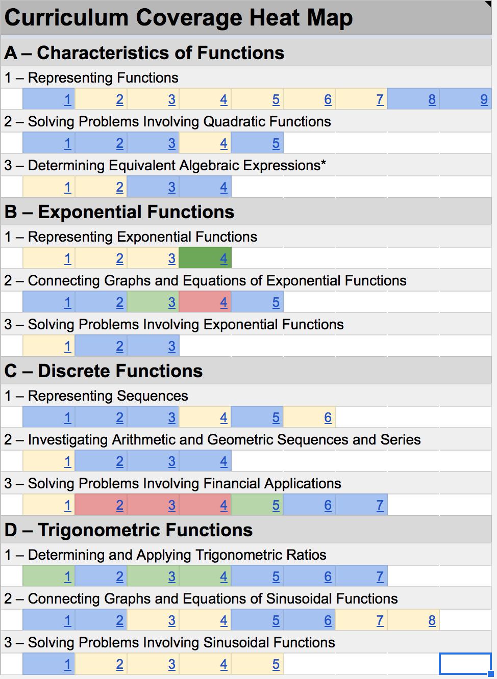
Curriculum Coverage Heat Map
A point in time while planning out Grade 11 Functions. The heat maps makes it clear that financial applications needs a little attention.
Colour codes are as follows:
| Color | Meaning |
|---|---|
| Red | No coverage |
| Yellow | Addressed once |
| Blue | Addressed twice |
| Light green | Addressed three times |
| Dark green | Addressed four times or greater |
To generate the heat map, while planning out the sequence of your course, all that’s needed is to tag what you are doing in a lesson or activity with curriculum expectations.
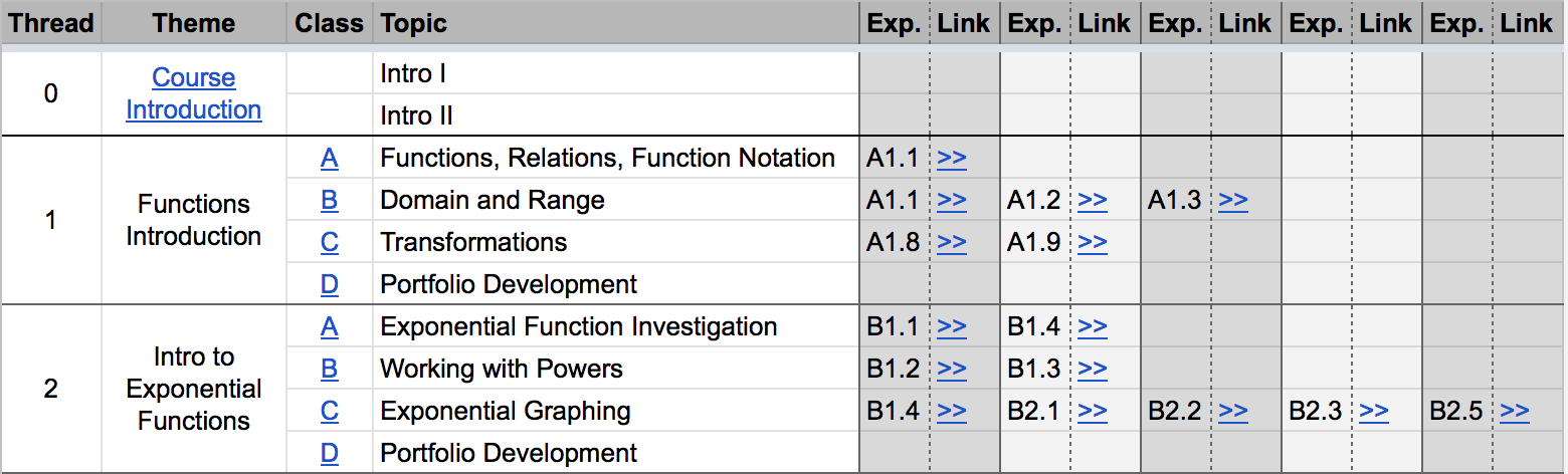
For example, with Grade 11 Functions a few years ago, a colleague and I built the course in a spiralling progression, using many small “threads” and attempting to revisit larger curriculum topics more than once in a given year. To keep track of the learning occurring, we tagged our plans using curriculum expectations. See the Exp. columns at right below:
Using the Planning Spreadsheet for an Existing Course
If you happen to teach any of the following Ontario courses then you are in luck. I've already built versions of this planning spreadsheet against the expectations from each course below:
- ICS2O - Grade 10 - Introduction to Computer Studies
- ICS3U - Grade 11 - Introduction to Computer Science
- ICS4U - Grade 12 - Computer Science
- MPM2D - Grade 10 - Principles of Mathematics, Academic
- MCR3U - Grade 11 - Functions, University Preparation
To use any of the spreadsheets above:
- Follow the link; you will be prompted to make a copy of the spreadsheet in your own Google account.
- Complete this one step so that links within your new copy of the spreadsheet connect to your own spreadsheet (and not the templates provided).
Adapting the Spreadsheet to Another Course
Adapting an existing spreadsheet like this to a new set of curriculum expectations is unquestionably a chore, but once it’s done, you can use it for a course over and over again, without having to go through this process.
- Use the PDF version of a course curriculum for reference if you wish, but the text-only version for cutting and pasting.
- To navigate within a text-only document, use Command-F and search for a passage of text.
To get started with adapting the planning spreadsheet to a new course, make a copy of the spreadsheet for any of the existing courses mentioned above.
Step One: Update Strands and Overall Expectations
This tab consolidates course strands and overall (major) expectations. It is used for reference and as a destination for hyperlinks from within the planning spreadsheet.
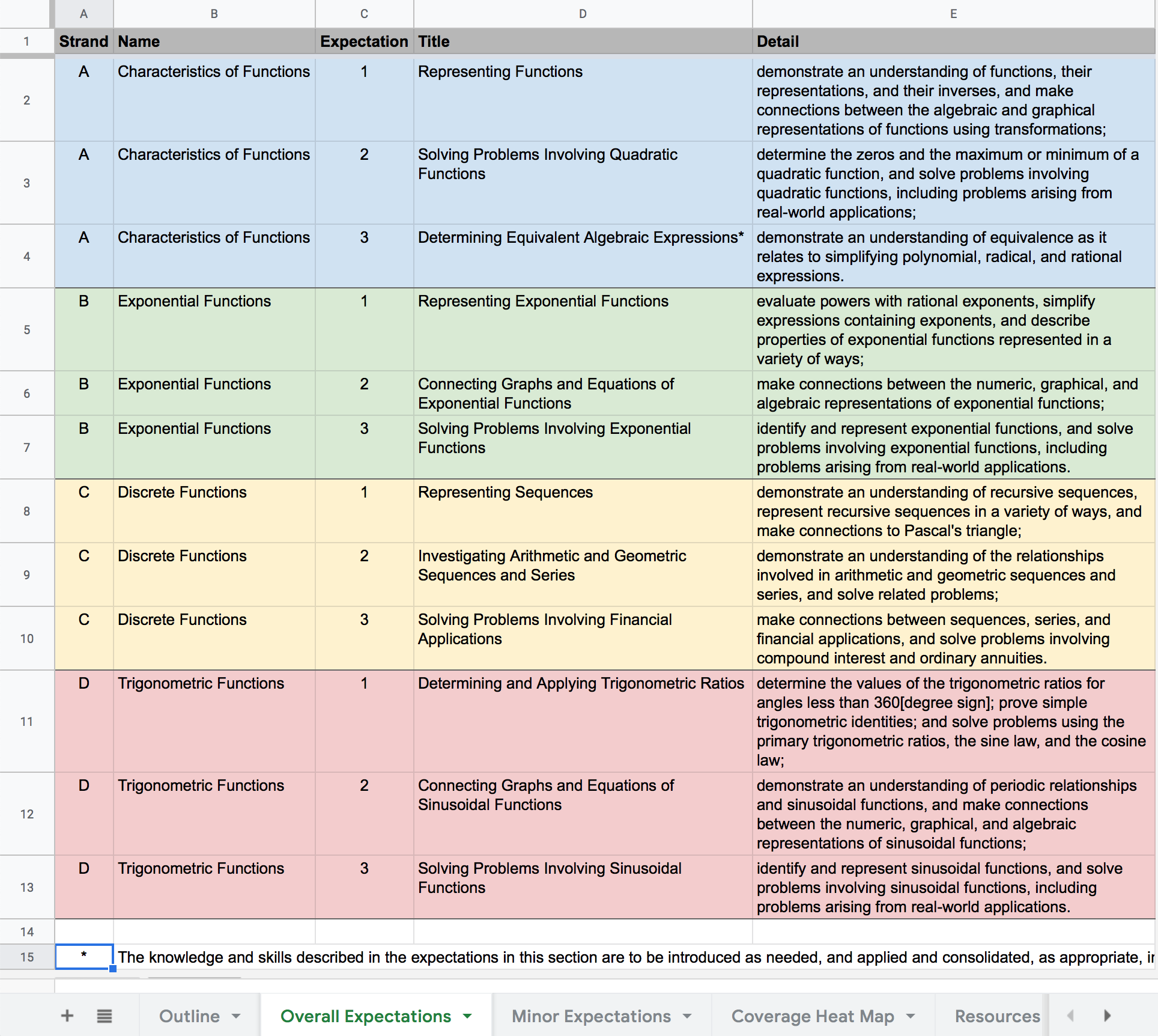
Open the curriculum documents for your course (see tips above) and begin cutting and pasting.
Colour coding for each row is managed automatically based on the contents of the Strand column.
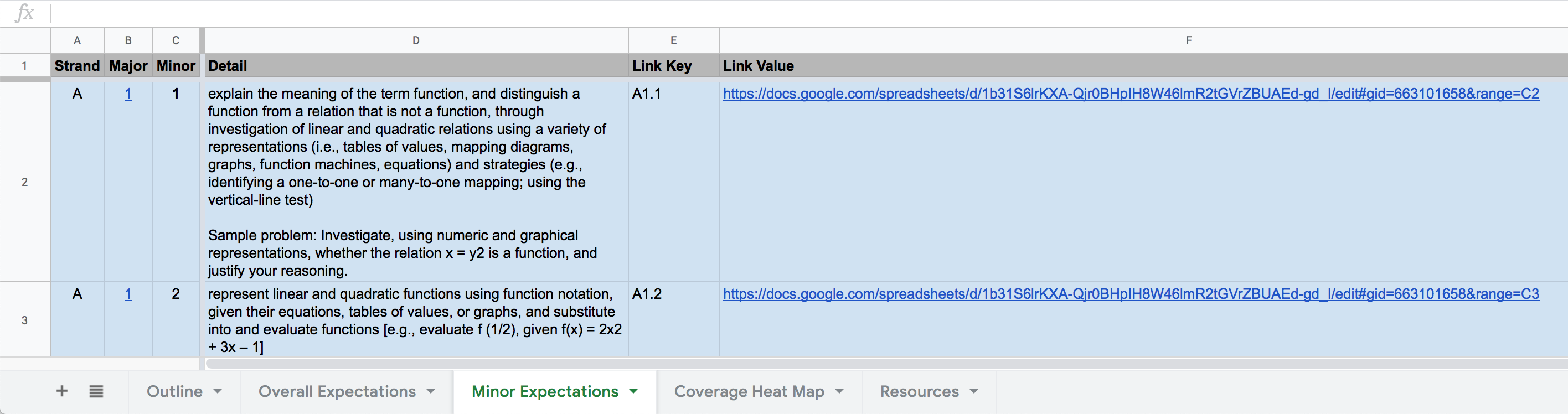
Step Two: Update the Minor Expectations
This tab consolidates the minor expectations for a course. It is used for reference and as a destination for hyperlinks within the planning spreadsheet.
The Link Key and Link Value columns are used for generating automatic links from the Outline sheet when you tag lesson plans with relevant curriculum expectations.
There are several sub-steps required to build out this part of the spreadsheet.
-
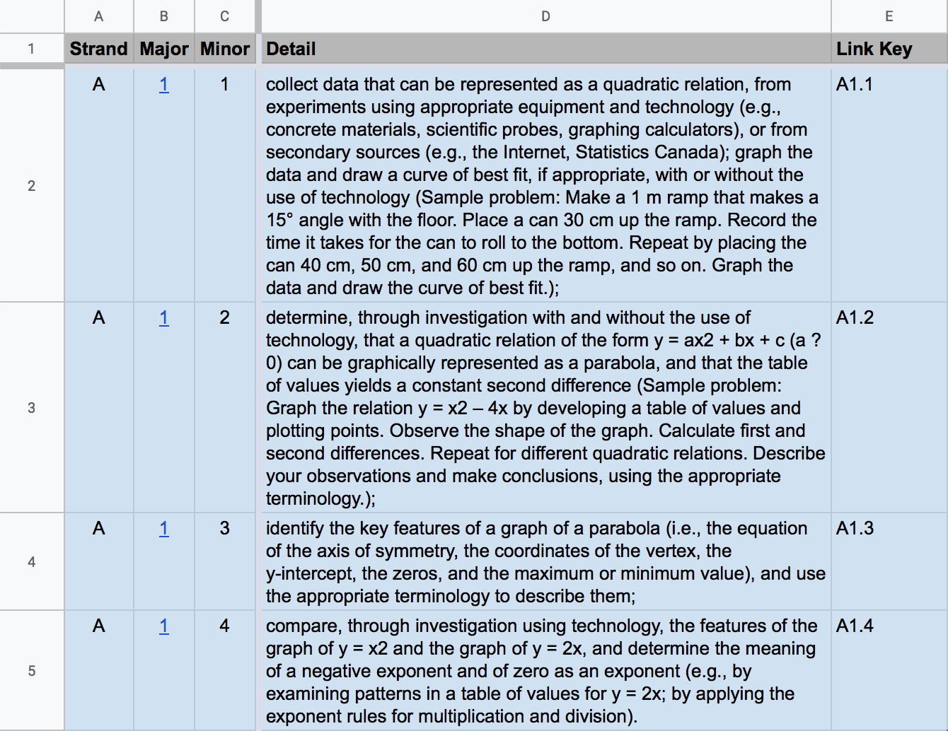
Cut and paste the minor expectations within each overall (major) expectation from the ministry curriculum document.
As you go, be sure to retain accurate labeling/numbering of strand, major, and minor expectations. The Link Key field will then be automatically populated.
For example, say that you are looking at the first strand (A), from the first major expectation (1), and there are four minor expectations (1, 2, 3, 4). The progression would look like this:
-
Notice that the Major column contains hyperlinks. These connect back to the Overall Expectations sheet. The first major expectation is cell C2 on that sheet. The second major expectation is cell C3, and so on. Cut and paste and/or adjust formulas for the Major column cells following this pattern.
-
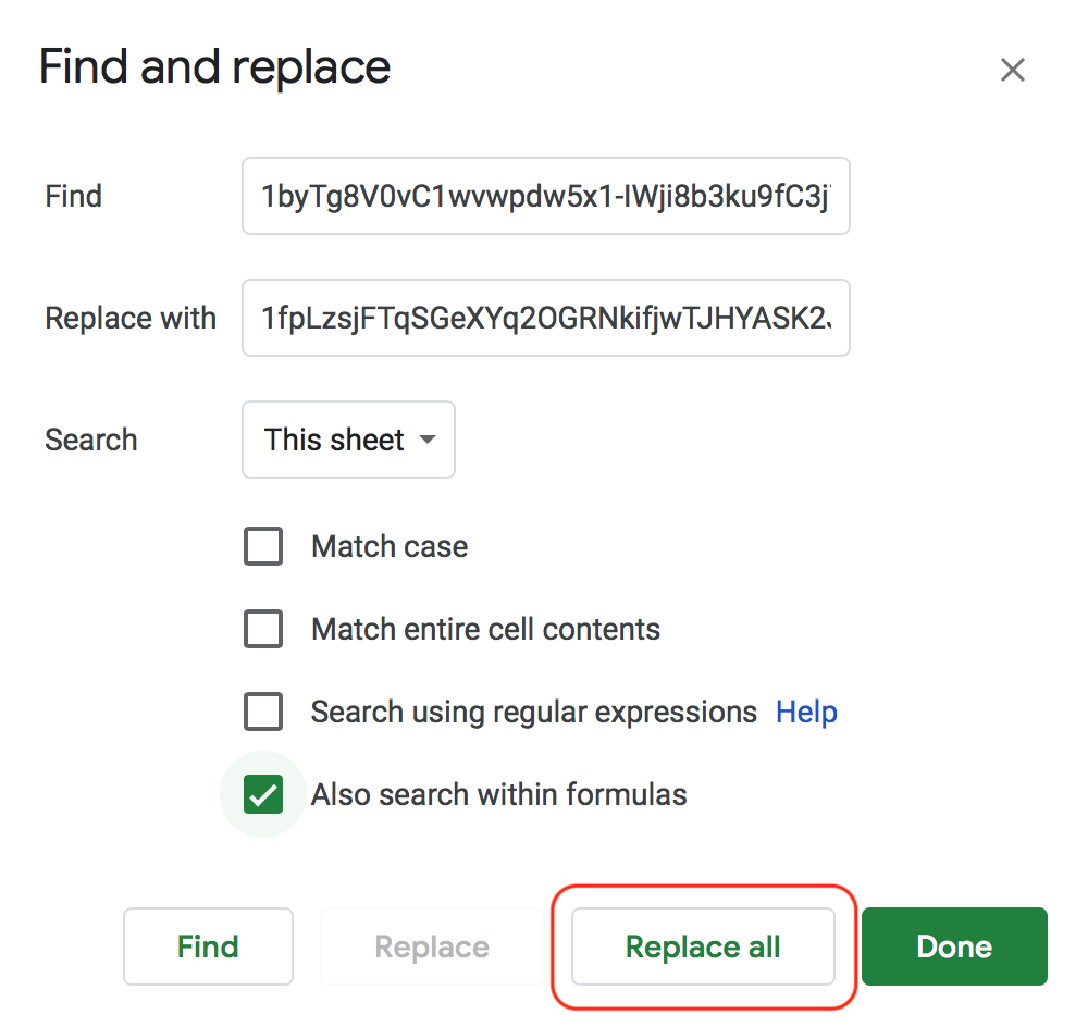
Finally, still on the Minor Expectations sheet, the Link Value column must be updated to refer to the current spreadsheet (rather than the originating spreadsheet from the template).
In the raw web site address from any cell in the Link Value column, identify the section noted here in red:
https://docs.google.com/spreadsheets/d/1byTg8V0vC1wvwpdw5x1-IWji8b3ku9fC3j7KwYkHgrc/edit#gid=663101658&range=C2The precise letters and numbers of that section of the link will vary. Whatever they are for the spreadsheet you are working in, highlight them, and press Command-C to copy to your clipboard.
Perform a find and replace for that text (Command-Shift-H).
Replace that existing text with the characters in the same section of the address for your own copy of the spreadsheet:

Be sure to configure the find and replace operation as shown:
Step Three: Revise the Heat Map
Now it is time to modify the heat map to reflect the major and minor expectations of the course you are building the spreadsheet for.
Here is what the heat map looks like for MCR3U (the course this planning spreadsheet was originally built for in 2017-18):
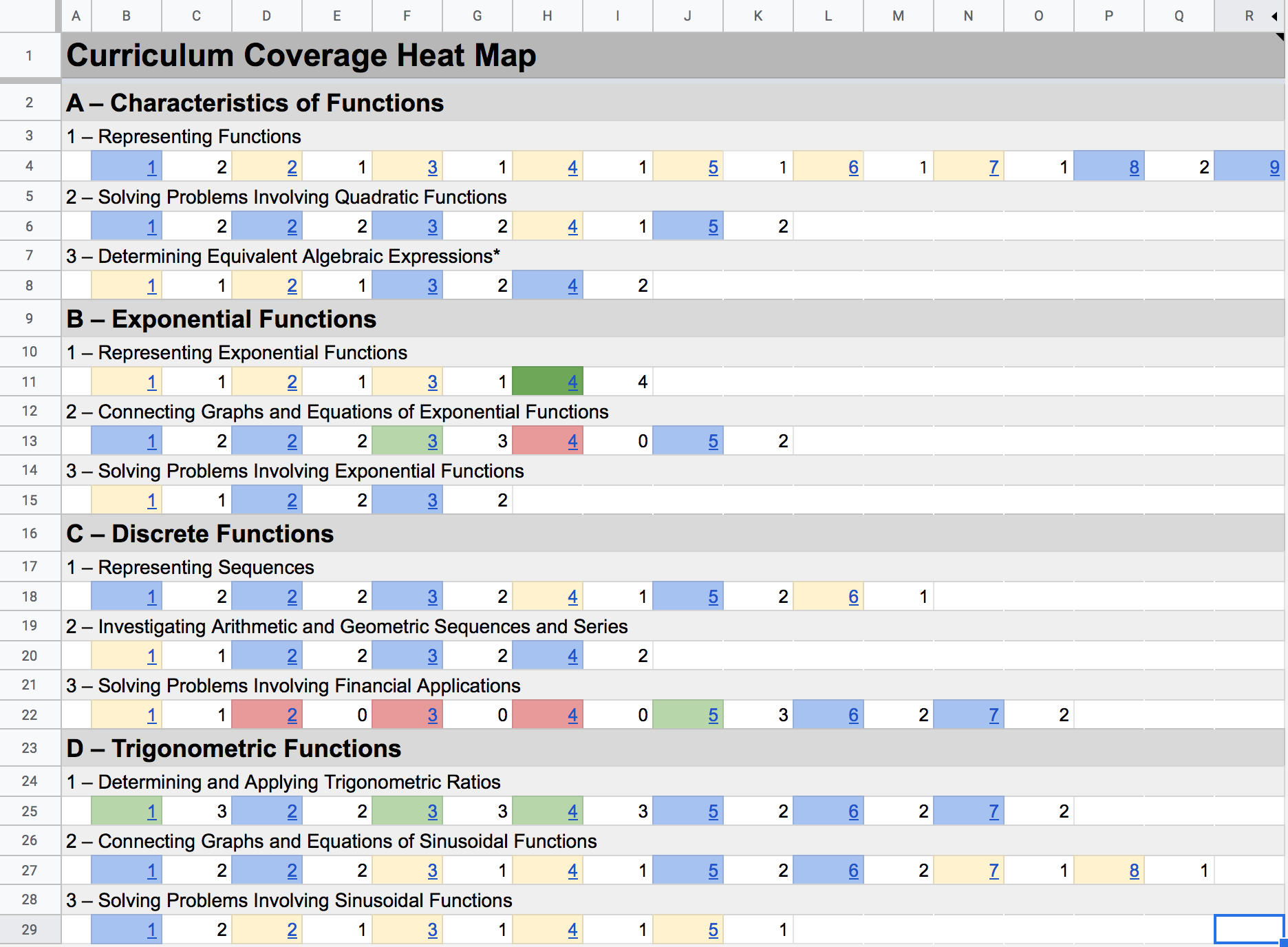
Note that the non-coloured columns (C, E, G, I, et cetera) have been unhidden so that the underlying logic of this sheet can be explained.
There are several sub-steps involved to update this sheet, but they do not take too long to complete.
-
First, update the text for the strands (bold, larger text in the screenshot above) by copying and pasting from the Overall Expectations sheet that you have already modified.
-
Next, update the text for the major expectations that are part of each strand.
-
Now to adjust the core of the heat map – the colour coded cells.
Each colour coded cell is shaded based on the cell to its immediate right.
For example, consider expectation A1.1 in the MCR3U spreadsheet:
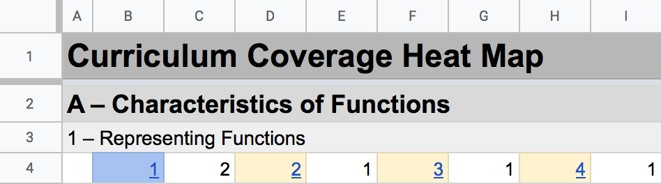
It is blue, because the cell to its right contains a 2.
The cell to the right contains a 2 because expectation A1.1 was tagged twice on the Outline sheet, meaning the expectation was addressed on two separate occasions throughout the year.
So how to update this part of the spreadsheet?
For each minor expectation, we need to update the link (on the colour-coded cell itself, B4 in the image above). We also need to update the formula that counts how many times that expectation was tagged (C4 in the image above).
For reference, open the Minor Expectations sheet in one browser window on your computer (if possible, it helps to work on a large monitor while doing this).
Keep a second browser window open on the Coverage Heat Map sheet.
Remember, there is one color coded cell for each minor expectation.
(If you need to add more cells for additional minor expectations, copy and paste from existing cells so that existing formulas and conditional formatting rules come along for the ride.)
First adjust hyperlinks for each color coded cell – in this example, we are linking to the minor expectation listed at cell C2 on the Minor Expectations sheet:
=HYPERLINK("#gid=663101658&range=C2","1")
Next, update the formula in the cell to the right, so that it counts occurrences of the correct curriculum expectation on the Outline sheet:
=COUNTIF(Outline!$H$2:$Q$100,"A1.1")
In this example, the formula looks for how many times expectation A1.1 was used as a tag for lessons.
So, after updating links and the formulas to count expectation tags – that should do it.
Of course, a bit of testing of your updated curriculum heat map is advisable.
As well, columns containing the white cells on the Coverage Heat Map sheet can be hidden, if desired.
Conclusion
My hope is that this article is helpful to other teachers.
If you do adapt this planning spreadsheet to another Ontario course, please let me know. I can add the course you've made a template for to the list provided above, allowing more teachers to benefit.